


Be creative with colour in the garden this spring
Register for free to read more of the latest local news. It's easy and will only take a moment.

Paint your garden with colourful plants and brighten your outlook throughout the year.
Whether you want a calming area to relax or a vibrant space to party, choose colour themes to suit your mood, combining plants and accessories to create the perfect garden for your health and wellbeing.
Plan the colour of your outdoor space as you would your interior by considering the colour of fences, walls, structures and landscaping materials as well as pots, ornaments, furniture and other features to combine with your favourite plants and flowers.
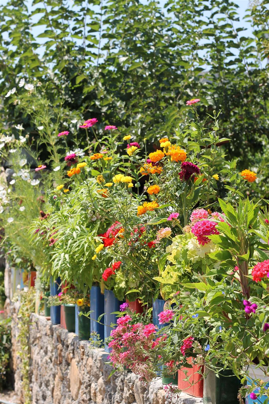
For somewhere bright and uplifting choose a colour palette with red, gold, yellow and orange – all colours with energy and warmth. Planted around a patio, and matched with furniture in equally uplifting colours, they’ll produce a joyful place to socialise outside.
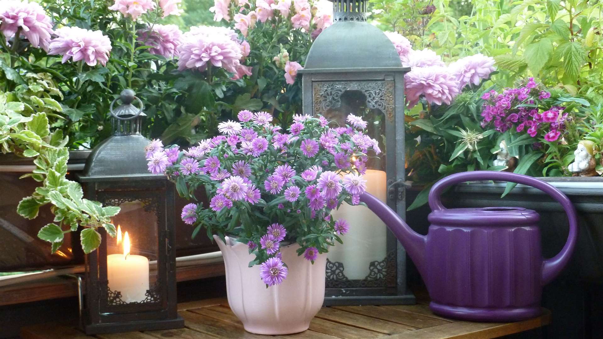
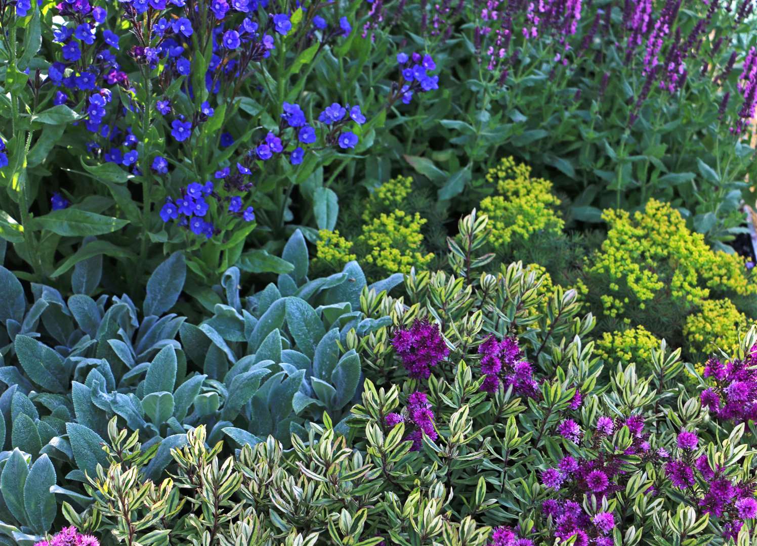
In contrast, create somewhere calm and relaxing using cool colours like blue, mauve and violet, set against a backdrop of green, and perhaps adding pure white and silver for a clean, tranquil effect.
With soft chairs to sink down into you’ll create a peaceful and restorative space to sit out and meditate.
Different colours can influence your emotions in different ways:
- Red – bold, bright and stimulating, exciting and eye-catching;
- Orange – warm and vibrant, happy and fun;
- Yellow – cheerful and welcoming, positive and stimulating;
- Green – fresh, natural and calming, peaceful and relaxing;
- Blue – simple, cool, calming and relaxing;
- Magenta / violet / purple – striking, powerful and energetic;
- White / grey / silver – pure and simple, clean and classic.
Creativity is rewarding and good for mental health, so explore your creative side by combining plants with other materials and features. Pick bold and dramatic plants to form a backdrop and set the stage for colourful seasonal stars to steal the limelight.
Mixing things up may be fun, but take care as a riot of colour can look unplanned and disorganised.
Of course, there’s more to choosing plants than just their colour, such as their shape and size, texture, suitability to your site and soil, their season of interest, and more.
At the end of the day colour choice is up to you, and if you like it that’s all that matters!
The colour wheel
Colours can be grouped into four broad categories, starting with the primary colours of red, yellow and blue. By mixing these primary colours you get secondary colours, so red and yellow create orange, yellow and blue make green, and red mixed with blue forms violet.
Mixtures of primary and secondary colours are called tertiary colours, such as a green-blue or violet-red. Lastly you have neutral colours such as white, grey, silver, brown and black.
To choose complementary colours try using a simple visual device called a colour wheel. Think of a pie divided into 12 coloured slices running from red to orange, yellow, green, blue, violet, and back to red.
Colours opposite one another on the colour wheel, or equally spaced in a triangle, are the most harmonious, such as red and green, yellow and violet, or orange and blue.
Did you know?
Colour can influence your visual perception of space. By growing bright red plants at the end of a long, narrow garden you can make it appear closer than it actually is, while cool, blue flowers will look further away, giving the impression that the space is larger.
Vibrant colours such as red and yellow grab your attention, drawing the eye away from eyesores or views you’d prefer to ignore, while pure white and gold shine out on dull days and brighten a shaded spot.